10 ways to give your products a more professional look
After you’ve scaled your business enough to upgrade from making your labels at home, it’s also time for a professional packaging makeover — from your container to your label. But figuring out how to design packaging is no small undertaking.
Start by considering the following factors:
- Audience development — Who is the ideal audience for your product? Is it millennials in their first home, or commercial cleaning contractors for public schools?
- Regulatory compliance — What compliance standards do you need to know? Are there big-name retailers or state and federal governments with key requirements for your product’s label?
- Environmental influences — Is your product intended for repeated use in demanding environments or destined for an easy-storage pantry?
- Container limitations — Are there inherent factors in my container that will dictate the need for special adhesive or label formats?
Once understood, the next step is building your actual packaging — and making it look professional is crucial. But what constitutes professional? Here are 10 elements to consider:
- Invest in quality materials
- Showcase your brand
- Consider color psychology
- Extended content labels
- Proper compliance
- Umbrella branding
- Form vs. function
- Make your label work harder
- Do a test run
And even if you don’t incorporate every tip, they’ll help you understand the baseline standards of professional product packaging.
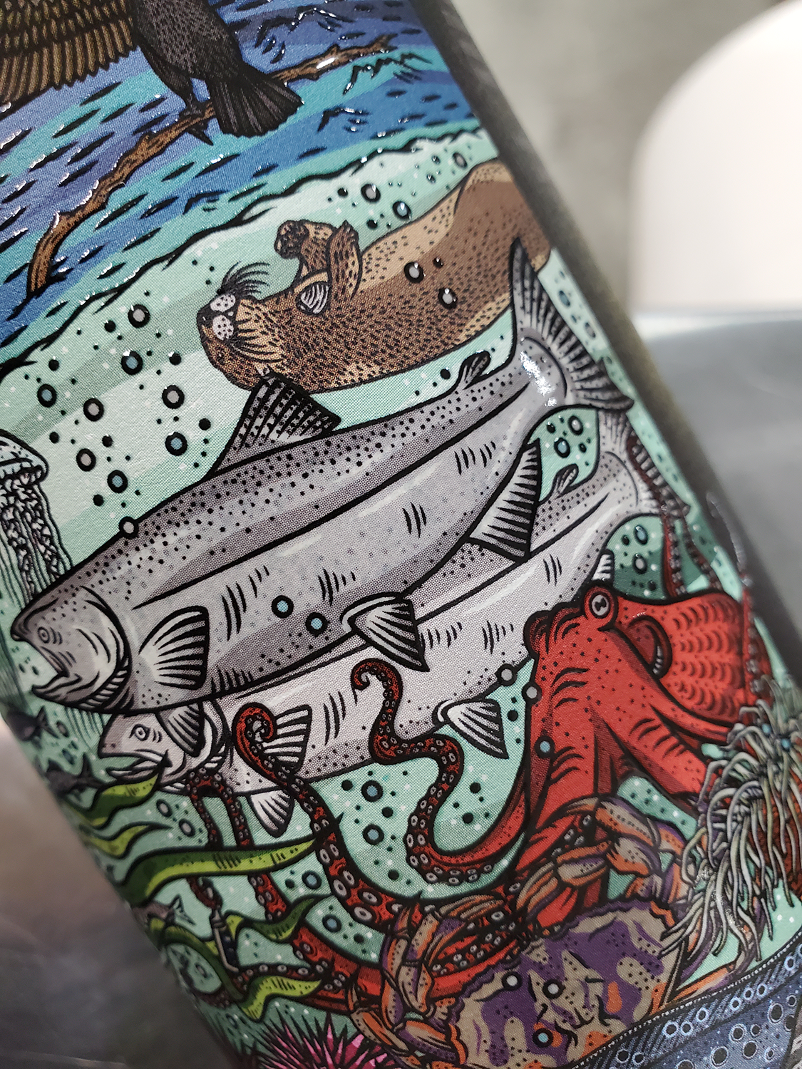
1. Spring for quality packaging materials
High-quality materials are aesthetically and functionally invaluable to your product packaging because they improve shopper perceptions of your brand.
When it comes to labels, you’ll likely want pressure-sensitive ones that don’t require heat or water to activate. They’re used in over 80% of labels across many product categories: automotive, household goods, food and beverage, wine, spirits, chemicals and more. Classic materials include biaxially oriented polypropylene (BOPP), estate paper, foil and semi-gloss paper — but more unusual materials may be an option, too. Just ask your provider for guidance to ensure they can still stand up to your product’s end-use.
Most importantly, defining “quality” is directly related to your product’s performance needs. Estate paper is an ideal material for high-end wine labels but fails when exposed to abrasive chemical solutions. Pick the right material for your product and its environment.
2. Show off your brand
Good packaging graphic design will bring your brand to life. Apple is a great example. Their thoughtful packaging approaches have differentiated their brand from every other competitor.
- Eye-catching logos — Symbols capture the spirit of your brand without saying a word. For Apple, they simply chose an apple.
- Visually appealing artwork — Art doesn’t suit every brand, but its clever use can further your brand’s messaging at first glance. Apple opted for an image of the product within, surrounded by generous white space that implies a clean, minimalist experience.
- Packaging worth touching — On the Apple AirPods packaging, their graphic design team used tactical embossing on the artwork to enrich the sensory surface of the box. Similarly, spot label varnish can draw customer attention to other design elements, like the lettering, for increased product differentiation.
3. Strategically choose your color combinations
For iconic products like Coca-Cola and Tiffany, color is the brand. Executed poorly, they can clash with your brand identity and instill consumer uncertainty.
Cool spectrum colors like blue, lavender and cool white can imply cleanliness, competence and simplicity. By contrast, red, orange and yellow brim with confidence, happiness and good cheer. Neutral browns and blacks are often used with products that are dependable and rugged or dramatic and sophisticated.
Color also extends to fonts, where contrast and legibility are key. This explains why you often see white text popping against red backgrounds.
4. Avoid wordy clutter
Bounce’s pet hair dryer sheets waste no time telling you what the product achieves: “Bounce — Pet hair & Lint Guard.” This offers a great lesson:
Keep it simple.
Nothing says “unprofessional” like an overcrowded package design layout. It gets in the way of clearly communicating your brand. Just think about it — when a shopper is strolling down the aisle, they need to know what you’re all about in a single glance.
But once you factor in logos, artwork, regulatory information and your name, designing a tidy label can be tough. A few tips to fix this:
- Less is more — Words take up a lot of room. Sometimes just restructuring sentences can free up space. Simply changing “Best coffee in Seattle” to “Seattle’s best coffee” cut four characters out and created a tagline.
- Change or resize your fonts … or your label — Playing with various fonts and font sizes can open up space and proportions in surprising ways. And if that’s not cutting it, consider expanding the size or shape of your label.
- Get layers — If all else fails, what you really need may not be any of the above solutions, but a second or third layer to your label itself. These are called extended content labels (ECLs), which we’ll outline next.
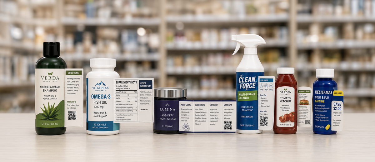
5. Decide whether your label needs layers
If you’ve ever seen a label that folds, peels or pops out, then you’re already familiar with extended content labels (ECL) and how they’re used. You’ll often find them on chemicals, pharmaceuticals, vitamins, nutraceuticals and products in very small containers with limited surface area.
These inner layers can contain required regulatory text along with ingredient lists, alternative languages and instructions. But ECLs are also effective marketing platforms for inserting:
- Later redemption or instant redeemable coupons (IRCs)
- Questionnaires and rebate forms
- Recipes, game and sweepstake pieces
- Cross-promotional products
- Corporate information and stories
6. Be transparent with product information
Candle packaging always includes a warning label instructing users to burn within sight, keep away from flammable objects, children and pets. That every candle has this isn’t by coincidence.
Depending on your industry, your product may be subject to mandatory retailer requirements or regulatory statutes. This can range from ingredients used in your product to the language that must appear on it.
But it’s also smart to include additional information such as the nature of your product — especially about any differentiators such as natural, organic, GMO-free, sustainability harvested, fair trade and more. To avoid cluttering up your label, extended content labels are a great solution.
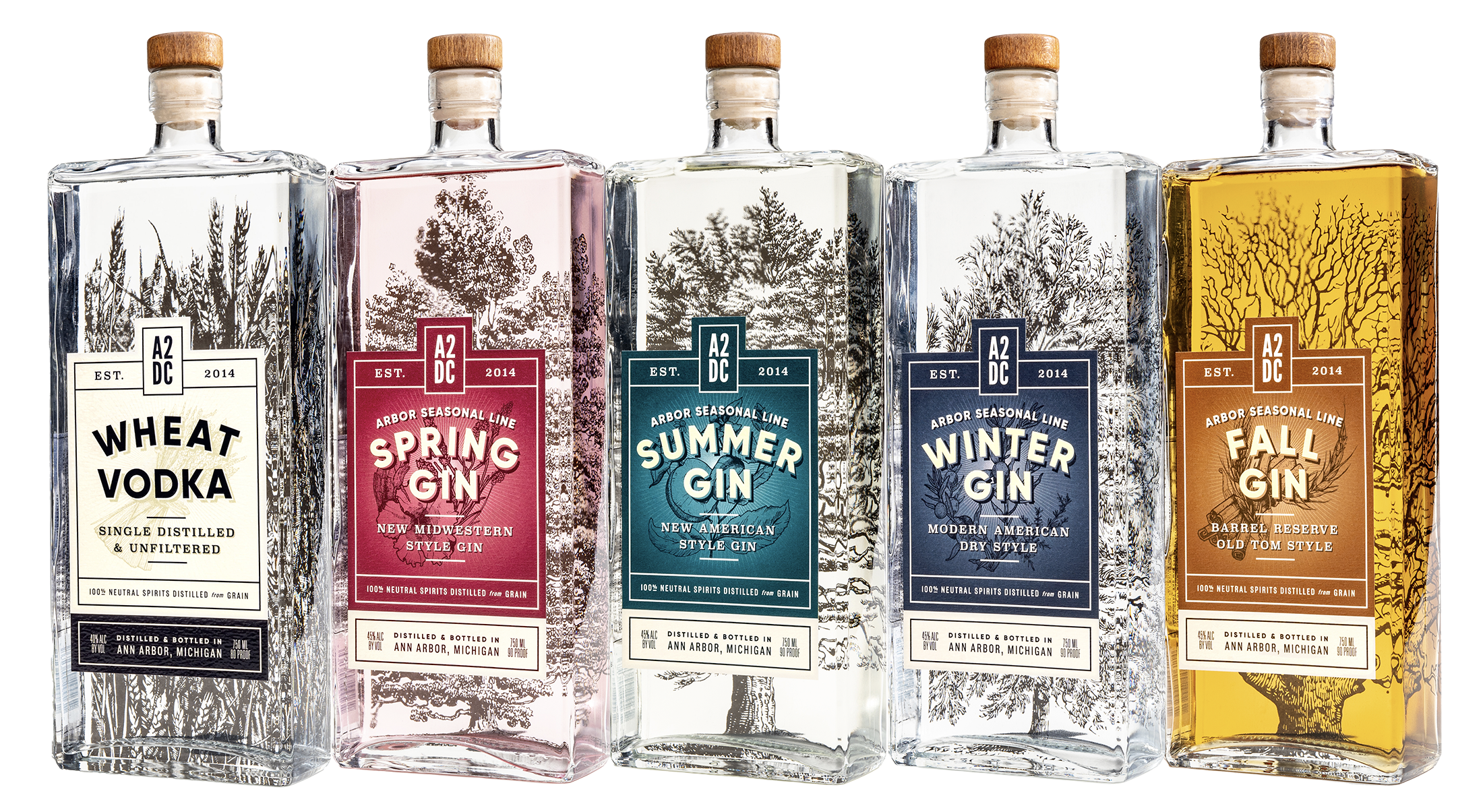
7. Coordinate your products’ appearance
If you have more than one product under your company umbrella, it’s important to unify branding through a consistent, coordinated voice, packaging and label. This will heighten your product’s visibility, reinforce your brand’s authority and give your team a focused marketing plan.
From cleaning solutions to hand soaps, Method has many different products in their lineup, but their minimalist packaging design, font, and label remain consistent across the brand.
8. Balance creativity and function for containers
Whether you’re vetting standard box packaging designs or Santa Claus jars, there’s room for both form and function — but function must come first. Container failure is not professional, and you must avoid it at all costs.
Before committing to a container, ask the following:
- Material — Is your container material compatible with your product? Can it safely hold and preserve your product?
- Ergonomics — How does your container shape affect storage needs, shipping logistics and the end-user?
- Security — Will your container survive your product’s lifecycle?
- Design — What is the compatibility of your container and your label?
From tear-off and resealable pouches to novelty squeeze tubes shaped like honey bears, custom packaging is a fun way to build brand differentiation and engagement. But if they’re too unique, they can spur problems with storage, shipping and even label performance. Something with an irregular surface, for example, can be difficult for label adhesion.
9. Make your packing secure
There are many ways to make your packaging itself more secure. This may include:
- Overt security features — Variable printing, tactile printing and holograms
- Covert measures — Infrared or UV inks, invisible watermarks and ink taggants
- Anti-counterfeit solutions —Invisible inks, custom laser cutting of shapes or images into label
- Tamper-evident security features — Shrink sleeves, pressure sensitive and film labels sealed over openings, peel-away labels with void messaging below and NFC tamper-evident tags
- Specialty tags — Unique RFID and QR codes to digitally verify the authenticity
This is by no means an exhaustive list, but an introduction into exploring your packaging’s expansive potential for protecting your brand.
10. Do a test run
Label failure? That’s not an option.
From rippling to flagged corners, have a conversation with your label partner to stop material and adhesion problems from hurting your products, your brand and your bottom line. Talking points should include:
- Facestock compatibility — Only certain adhesives work with certain materials.
- Permanence or removability — This will affect the basic formulation of the adhesive.
- Container surface— Smooth surfaces make adhering easy, but textured containers require a thick, soft adhesive to fill in porous surfaces. And the curvier the container, the greater the need for a fast-curing adhesive to hold the label in place quickly.
- Environmental challenges — Moisture exposure, extreme temperatures and contamination will determine best-fit materials, coatings and adhesives.
Get yourself a professional packaging partner
To achieve top-notch professional packaging, you’ll eventually need a professional partner.
While you’re evaluating different suppliers, look for these baseline quality control measures to set yourself up for success:
- Industry-standard checkpoints — Reviewing approved artwork, color consistency and barcode checks before production starts.
- Live approvals — This gives you the chance to make final suggestions like fine-tuning the varnish or making color corrections before printing.
- Discrepancy safeguards — A qualified packaging partner will have digital or manual systems in place to catch defects during production.
- Post-production inspections — After your containers or labels are made, boxers should inspect them to confirm they match the job ticket.
Whether or not you’re ready to work with a professional partner, the packaging design basics outlined here are sure to put you on a successful path forward.