Cost Conscious Luxury Labels for Finger Lakes Winery
While the craft of winemaking has been perfected for millennia, contemporary wines are often sold on the remarkable appearance of their labels.
That’s why a New York family-owned operation named Anthony Road Wine Company asked us to help update their wine labels to establish a strong foothold in the region and expand into the national marketplace, all while maintaining a reasonable budget.
The result? A best-selling product, label spend reduced by 20% and an iconic brand look that has since been expanded to 11 different wines.
A quick overview
- Location — Penn Yan, New York
- Primary problem — Outdated, inconsistent label line
- The solution — Streamline production, upgrade to premium materials, update and embellish design
- Added benefits — Expert cost reduction recommendations, increased regional and national brand awareness
Creating a luxurious label for a family business
John and Ann Martini run their vineyard on love and family. Their children, who grew up playing in the vine rows, have grown up to assume leadership positions within the business and help it develop, while raising their own children.
Anthony Road’s prior labels had traditional appearance that one might expect from an established family operation, but they wanted to upgrade to a pressure-sensitive label that would draw people’s attention and stand out amid other bottles on the store shelf.
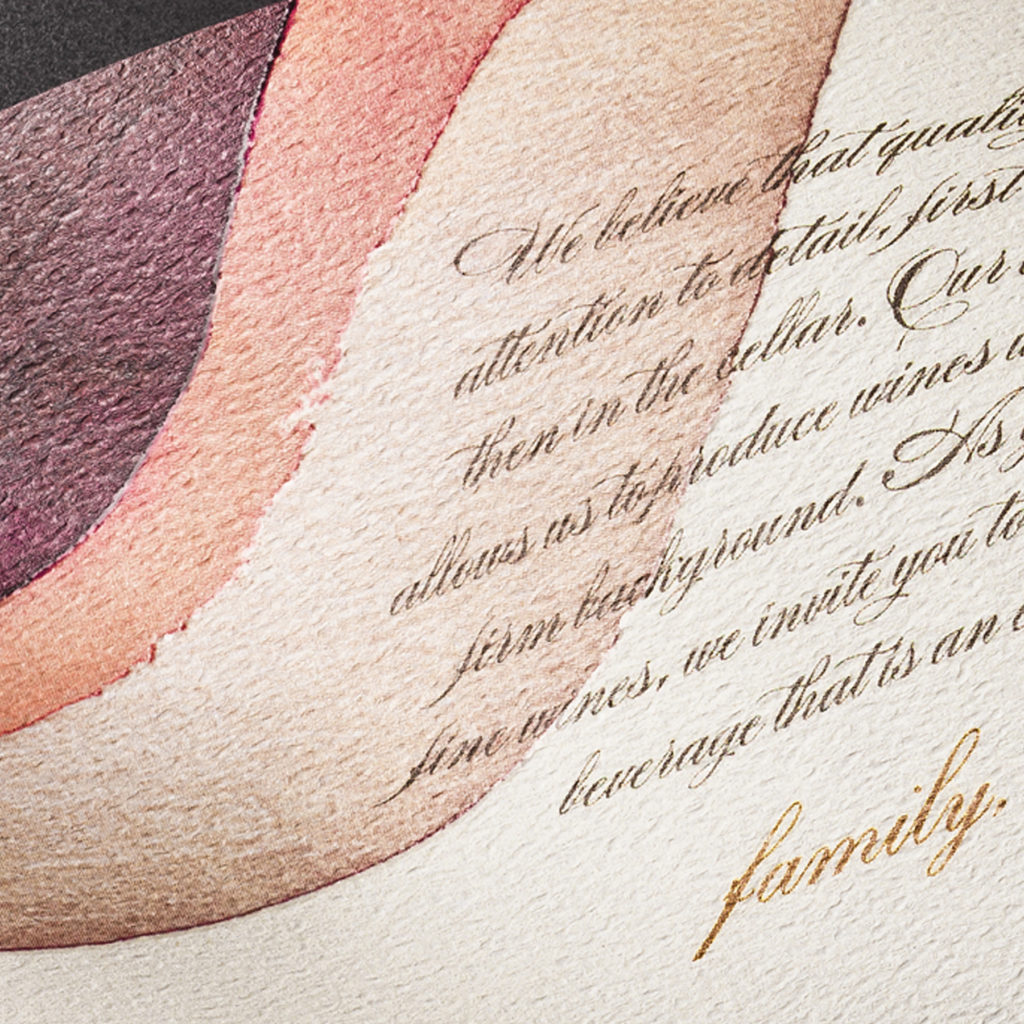
We helped them create a cutting-edge, artistic design that demands attention and elevated the brand’s reputation throughout the nation. The designers worked with the winery team to utilize existing capabilities and efficiencies to maintain reasonable production costs.
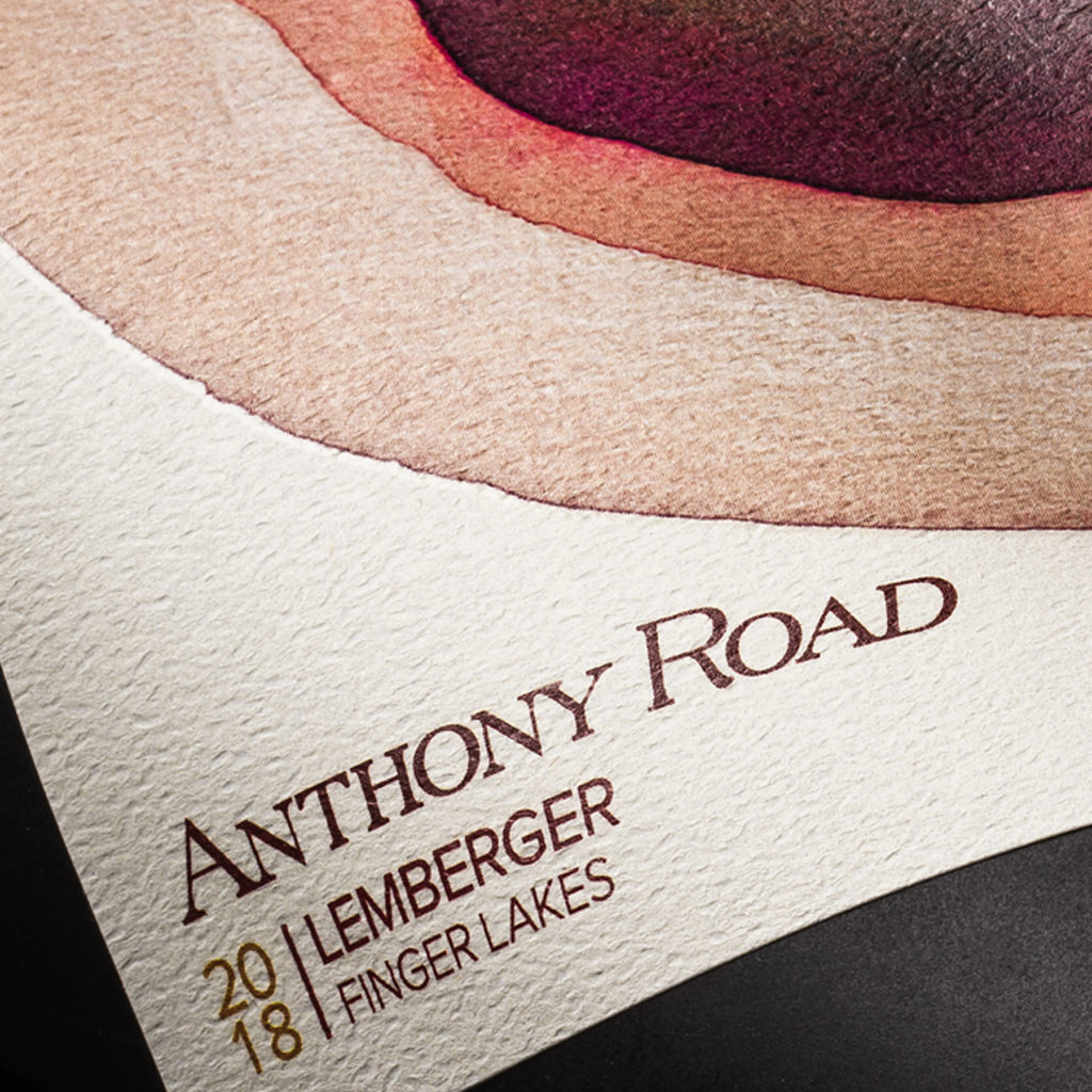
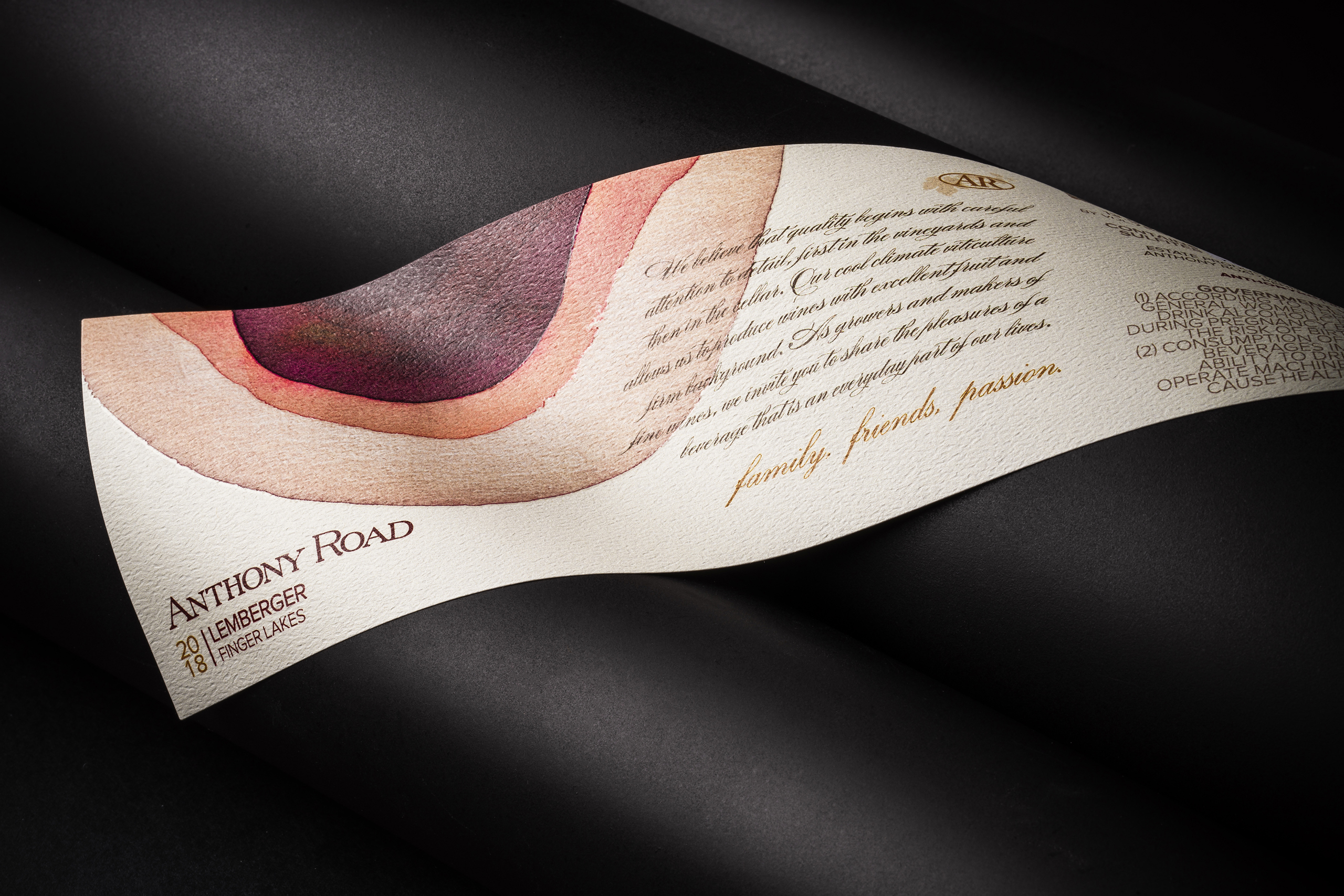
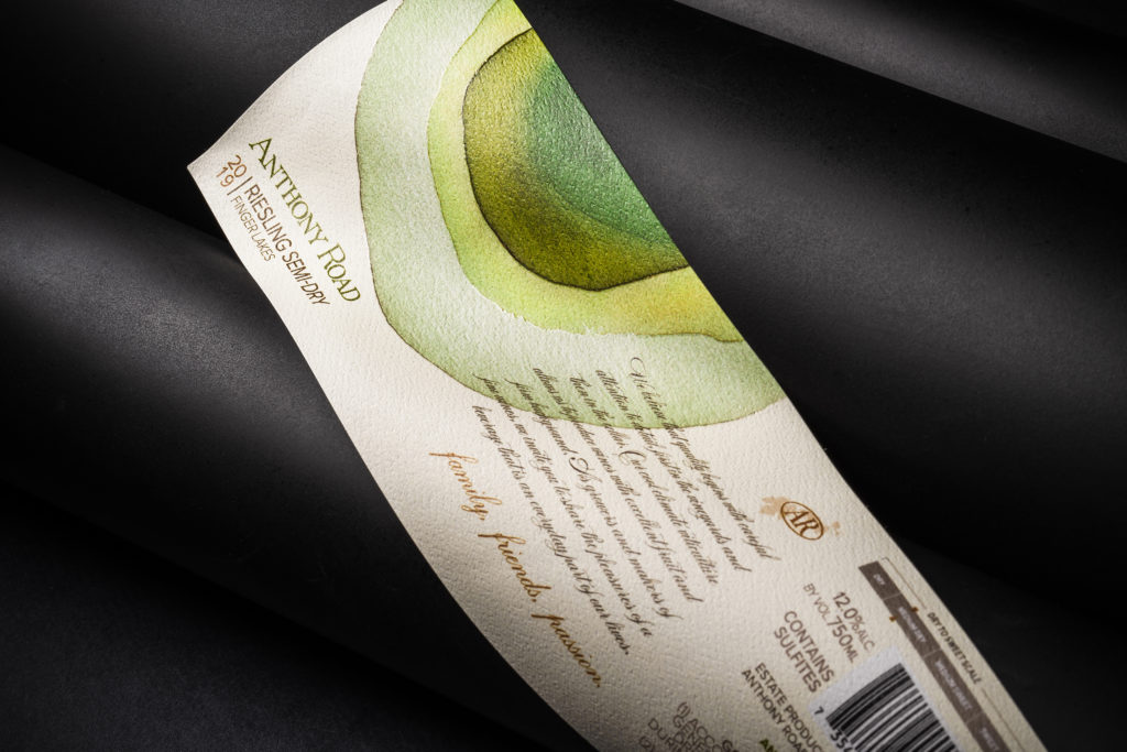
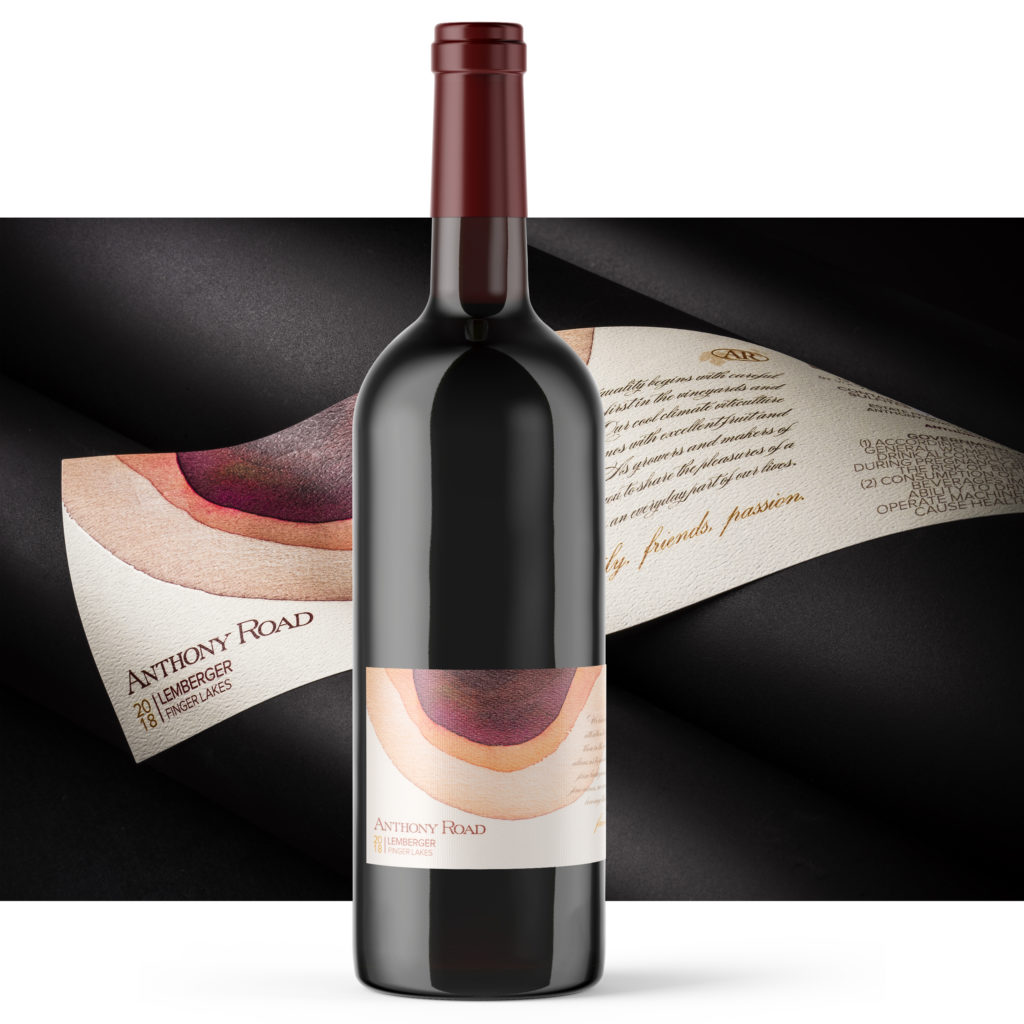
The resulting mottled watercolor quickly became an icon of the Finger Lakes region that shoppers recognize from across the aisle.
The artistic style expanded across the vineyard’s wide varietal line. Now all of the wines are connected with an aesthetic theme that allows each variety its own distinct visual appeal.
Limiting costs
While the Anthony Road team knew the labels were going to be an investment, limiting production costs was a major consideration throughout the process.
Our team worked closely with John and Ann to prepare the bottling line, select materials, choose embellishments and lay out the label.
The team initially went through what we refer to as the pre-press, in which our skilled team assured that every label met Anthony Road’s color and brand requirements.
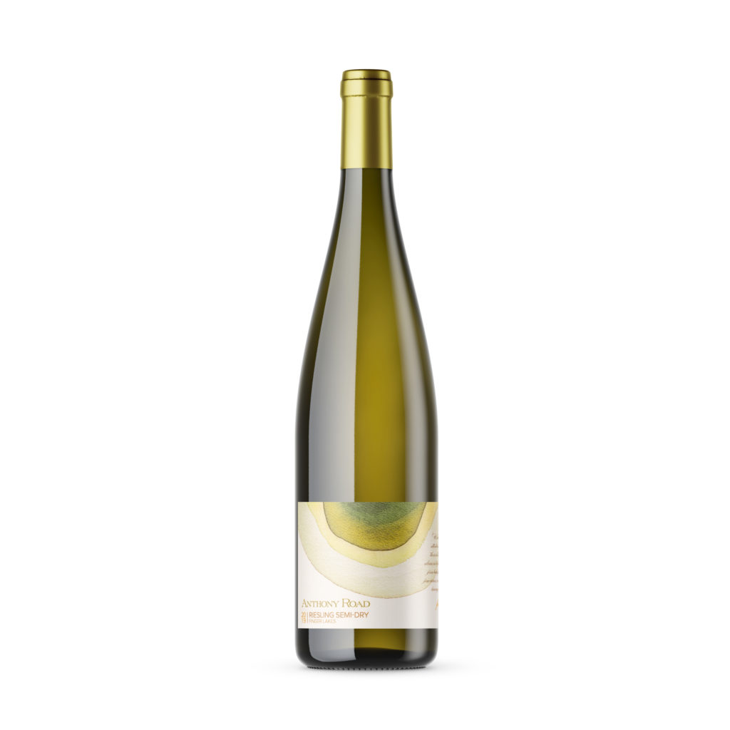
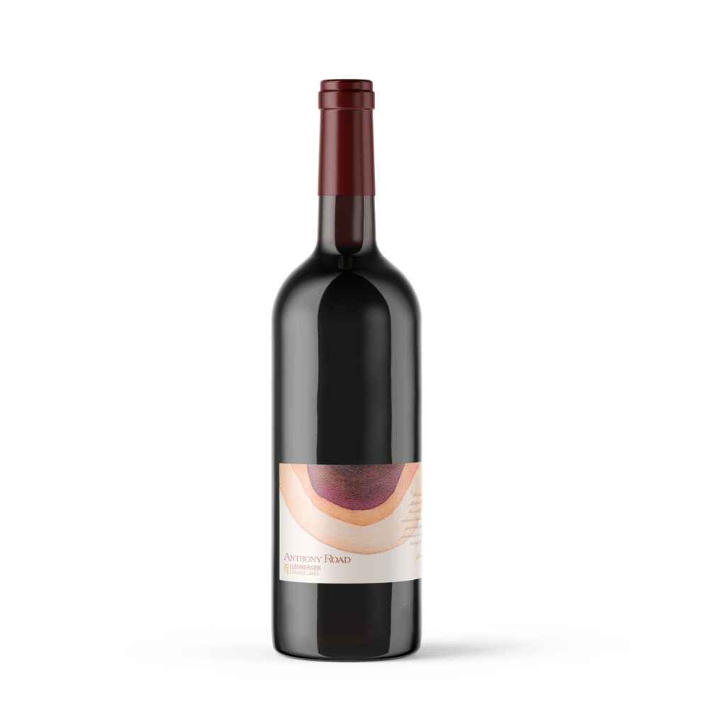
Our experts recommended a wrap-around design to cut costs and maintain a premium appearance all the way around the bottle. The front and rear aspects of the label are printed on the same deluxe sheet that extends over the bottle, rather than using a cheaper, separate sheet for the back label. This saves time and money as each bottle only has to go through the label applicator a single time, rather than twice to place the front and back labels, respectively.
We decided to produce the labels with a digital printer, which is ideal for small- and medium-sized runs and requires very little press setup. Digital printing consistently creates the highest quality images. It also allows for variable printing, in which multiple designs can be printed during a single run. With this method, we can print all the labels for each of Anthony Road’s wine varieties in a single run.
Aiming to catch the eye
Our team designed a label with colorful artwork and helped John and Ann select premium materials and embellishments. The team ultimately went with a slim-lined, wrap-around felt material enhanced with spot varnish and hot stamping.
The former labels featured a generic, text-reliant design printed with high-gloss on economical stock paper. We guided them in a more luxurious direction that better represents the quality of wine within the bottle.
A similar watercolor appears on each variety of Anthony Road’s line, such as unoaked chardonnay, pinot noir, sparkling riesling and rosé of cabernet franc. The unique color scheme of each painting complements the wine variety. The chardonnay label, for example, begins with an olive color in the top left side and transitions to a light yellow that is similar to the color of the wine inside.
Felt gives the labels a sense of elegance and offers a raised texture that looks smooth but is a little rough to the touch. Touch is very important in the psychology of fine labels. A neuromarketing study found that textured paper activates a sense of authenticity and premium quality in the consumer when compared to flat, untextured materials.
Hot stamps add a distinct, decorative touch to each label that also adds to the bottle’s luxurious appearance on the shelf.
Spot varnishes are used to highlight a key component of the label design. In this case the varnish was placed over the brand name. The selective application of varnish creates depth on the label.
Our team provided fully embellished samples of each label to test drive the effect of each design before Anthony Road had to place a single order. Since then, we’ve worked hard to ensure that every subsequent order arrives on time and meets specifications.
Results
The entire Anthony Road varietal line now has a modern appearance with premium materials that helped the brand become an icon of the Finger Lakes region that people recognize around the nation. The new labels were designed around the capabilities of the winery’s bottling line to work seamlessly with the existing operation, within their budget constraints.
The labels convey a striking contemporary eloquence, replacing crowded text with an abstract work of art.
Ready to revolutionize your labels?
Reach out to our skilled team at Resource Label Group to find out how we can help your branding reach the next level. We will guide you through the best materials, printing methods and branding strategies for your products. Our experts will aid in the budgeting and design of each label before producing and delivering every order with pinpoint consistency. Together, we can create a beautiful label that helps tell your company’s story to the world.