More than a facelift: How 3 wineries discovered the true value of a label rebrand
Branding will always influence the experience of sipping a glass of wine. The label, and the way it looks, simply can’t be separated from the wine, and the way it tastes.
Established wineries know this well. They’ve worked hard year after year to build a brand that loyal customers happily bring into their homes and restaurants.
Still, even decades-old wineries need to update their labels every now and again. Below, we’ll walk you through the label redesign journey of three such wineries. You’ll learn how we transformed their labels without losing their hard-earned brand equity.
But rebrands aren’t only about contemporizing your label.
Rebrands are also a chance for your brand to save money and improve delivery times. And, if you’re dissatisfied with your current label supplier, they’re a great opportunity to seek out and establish an invaluable partnership with a new one.
That’s why we won’t focus solely on the design. We’ll also uncover the things you can’t see just by looking at the label:
- Cost — Saving money through production-focused design
- Security of supply — Meeting delivery deadlines, time after time
- Quality of production ideas and execution — Establishing an ongoing, consultative partnership with a label supplier
How a label partner finds value for you
These wineries didn’t just get a label printer — they got a true partner. See the National Reach, Local Touch difference for yourself.
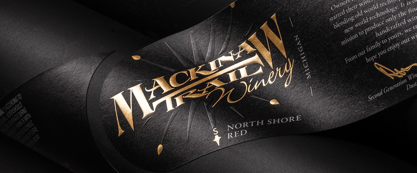
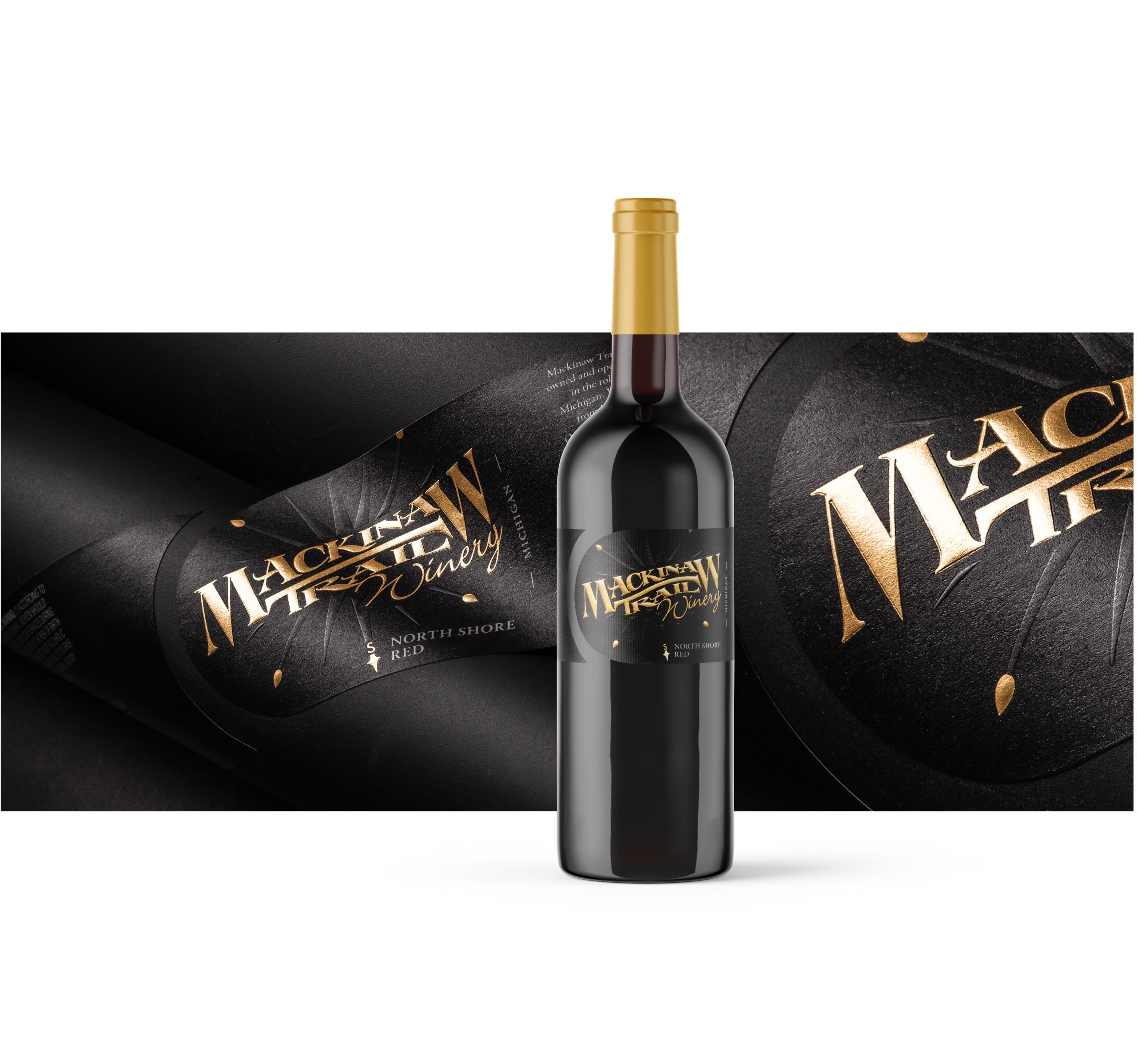
Mackinaw Trail: Now they can’t keep their wines on the shelf
Mackinaw Trail Winery & Brewery has been a staple of the Michigan wine scene for almost 20 years. And while their previous label designs had served them well, it was time for something new.
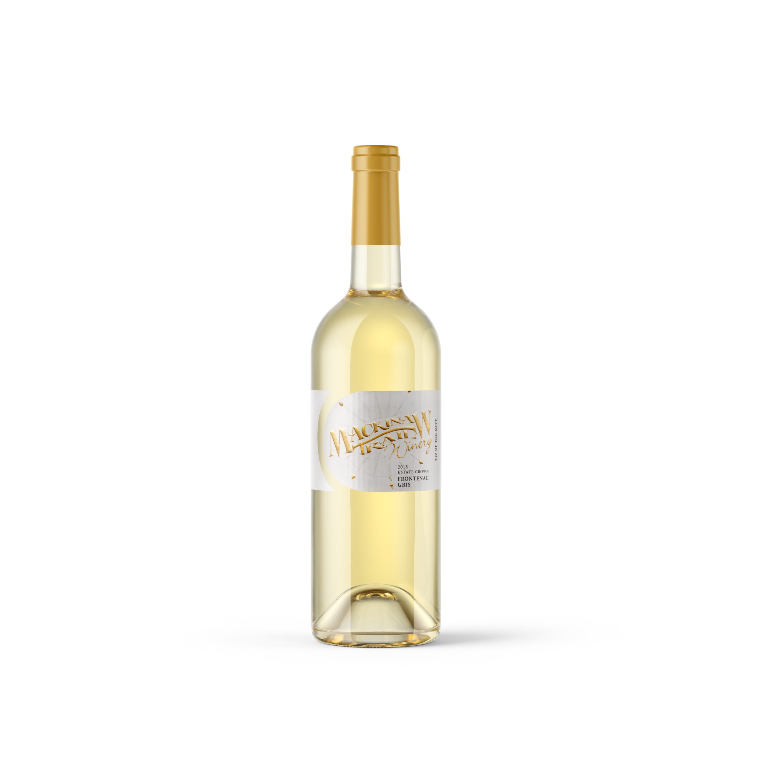
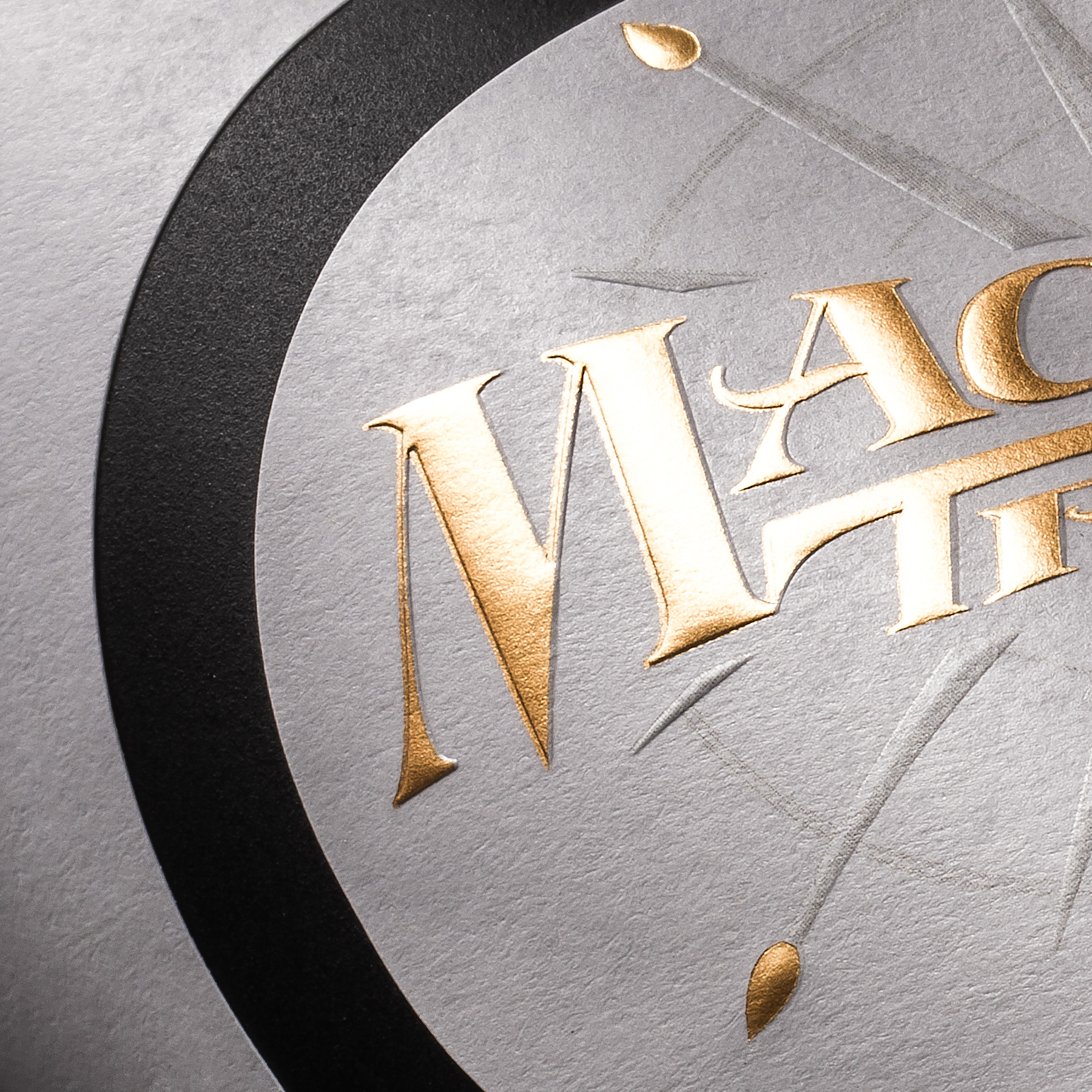
After our consultative design process, our team recommended they switch to a fresh dieline and add some gold foil to highlight the compass, brand name and winemaker’s signature to create a clean, contemporary look. This involved process typically takes a few rounds of changes, where we work with the client to narrow in on exactly the design updates needed to elevate their brand.
Their updated packaging opened up distribution possibilities and, in the client’s own words, they “can’t keep it on the shelf.”
A quick overview of Mackinaw Trail Winery & Brewery
- Location — Michigan
- The primary problem — They were being underserved by their previous label supplier
- The solution — Establishing a consultative partnership where we identify opportunities to save money and improve performance
- Added benefits — Updated branding that flies off the shelves
Production-focused design cuts cost, improves application and enhances performance
With every design choice we make, we’re always thinking about how the label will actually be produced on the press and applied on the bottling line. This type of production-first thinking allows us to create cost-effective, high-performance labels by design.
With Mackinaw’s redesign in particular, updating label shape wasn’t only a design play — it also resulted in a cost savings to the tune of about 20%. And we moved them from a standard paper material to a weld facestock. The new material not only presents nicely on the shelf, but it also performs well in ice-bucket conditions.
Our vast experience producing labels that apply cleanly and perform well has paid off. Mackinaw Trail isn’t having any issues with labels coming off the bottle and, in fact, they’ve reported that applying them on their bottling line is a dream.
More than just a label supplier
Our relationship with Mackinaw Trail began with us presenting them with labeling ideas (e.g., production efficiencies, design updates, fully embellished samples) they hadn’t been exposed to while working with their previous supplier. It was definitely a case of proving the value of our thinking before winning their trust and their business.
And that exchange of ideas still defines our relationship with Mackinaw Trail today. While they’re happy with their labels, it’s our creative thinking that makes us a consultative partner, not merely a label supplier.
Magnotta Winery: The art of a cost-conscious rebrand
Grapes sourced from Ontario; experiences imported from all over the world. That’s what Magnotta Winery’s International Series of wines promises. With more than 20 SKUs in the series, they’re importing a lot of experiences — and all of them need a label.
When Magnotta wanted to breathe new life into these labels, they partnered with us to design, embellish and produce them.
But they didn’t want a complete design overhaul. As an established Ontario winery, they wanted to maintain the brand equity they’d work so hard to build over the decades. Just as importantly, they couldn’t afford a huge jump in price for the new labels.
A quick overview of Magnotta Winery
- Location — Ontario
- The primary problem — A busy, dated label design on one of their most popular wine series
- The solution — Simplifying the design to look more contemporary while maintaining key brand pillars
- Added benefits — Keeping costs in check by optimizing the label size
Cost reductions courtesy of creative thinking
Resilience and tenacity are at the core of who Magnotta is as a company. After all, the winery was born at the beginning of a recession — and succeeded through grit, pricing their bottles right and, of course, making incredible wine.
Sticking to their roots, this rebrand was not an “at-any-expense” affair.
Our team looked for ways to elevate the brand without elevating the price. Through creative thinking, we were able to streamline production — simply by modifying the label shape. With those savings, we were able to switch them from a high-gloss paper to a rich, sophisticated felt facestock.
At the end of the day, Magnotta got updated labels and a refreshed brand, and we got the satisfaction of a job well done.
Rebranding, while maintaining key brand pillars
The labels for the International Series all feature two main design elements: A stamp and a painting. The stamp speaks to the intercontinental nature of the wines, and the painting to their worldliness.
Both elements needed to remain in the redesign.
We made the painting the main feature of the updated label, with only a thin black strip denoting the varietal and country of origin. These paintings — which come from the owners’ personal art collection — are foundational to the brand, serving to tell the unique story of each wine and augment the experience of drinking it.
As for the stamp, a custom die cut did the trick. The deckled edge on the left border gives the whole label a stamp-like appearance. The shape gives a subtle nod to the international theme, while eliminating the stamp as a competing design element.
The end result? A contemporary label design that maintains the brand elements loyal customers have come to love about Magnotta’s International Series.
Dr. Konstantin Frank: Honoring the past while celebrating the future
As the first and oldest winery in the Finger Lakes, Dr. Konstantin Frank Winery has built up massive brand recognition and equity since 1962. And they weren’t the first by chance. Dr. Frank — the winery’s namesake — was the first to be able to grow European vinifera grapes in the cold climate of the region. His family has continued to grow grapes and make wine ever since.
This was a legacy worth preserving.
When the family decided it was time to update their labels, it needed to balance the future and the past. But they had a difficult time deciding what design fit the bill.
We worked with them to create fully embellished samples, allowing them to picture what their wine labels would look like with different designs. They were able to compare full-color renderings of their vista to black-and-white drawings. And they tested different embellishment combinations — hot stamps, embosses, varnishes.
Ultimately, they went with the felt label, which achieved their vision: A classic look with a modern twist.
The full-production samples allowed them to be confident in their choice. Because production samples were also sent to their design agency in Toronto, everyone — the client, the design house and the label printer — were all on the same page throughout the process. And when they placed their first order, they knew exactly what the finished product would look like.
A quick overview of Dr. Konstantin Frank Winery
- Location — Finger Lakes Wine Country in New York
- The primary problem — A stale, dated label design
- The solution — Modernizing their labels while preserving their brand equity
- Added benefits — Secure label supply, ensuring they always have the labels they need ahead of their bottling dates
No missed delivery deadlines — not one
This doesn’t happen by chance, but through proactive and clear communication. Dr. Konstantin Frank has their own in-house bottling facility, and so they set their own production timelines. We reach out to them well ahead of their deadlines, making sure we’re able to align label production around their bottling dates.
When they say they need labels by a certain date, we pay attention. And when they need a quick-turn order, we get it done. It’s as simple as that.
Let’s help you get the most out of your winery’s rebrand
You don’t just want a label redesign — you want to save money, improve delivery consistency and establish a go-to resource for all your labeling questions.
We can help.
For us, the design is just the launching off point. From there, we’ll consider how to cut costs, what embellishments will complement your design and how to make sure your labels apply well on your bottling line. To start the conversation, reach out to our team today.