Getting the no-label look: The ultimate guide to transparent labels
Clear labels hide in plain sight.
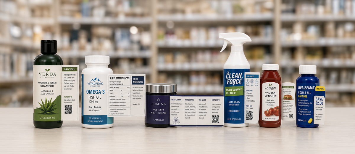
Once you start looking, you can find this high quality “no-label look” across nearly every market vertical, from wine and spirits to personal care products to food and beverage and many, many more categories.
When your label designer chooses to print onto a clear pressure-sensitive film, the final effect is nearly seamless, imitating direct print on any container — without the extra cost and high order minimums.
Your quick start guide to custom clear labels
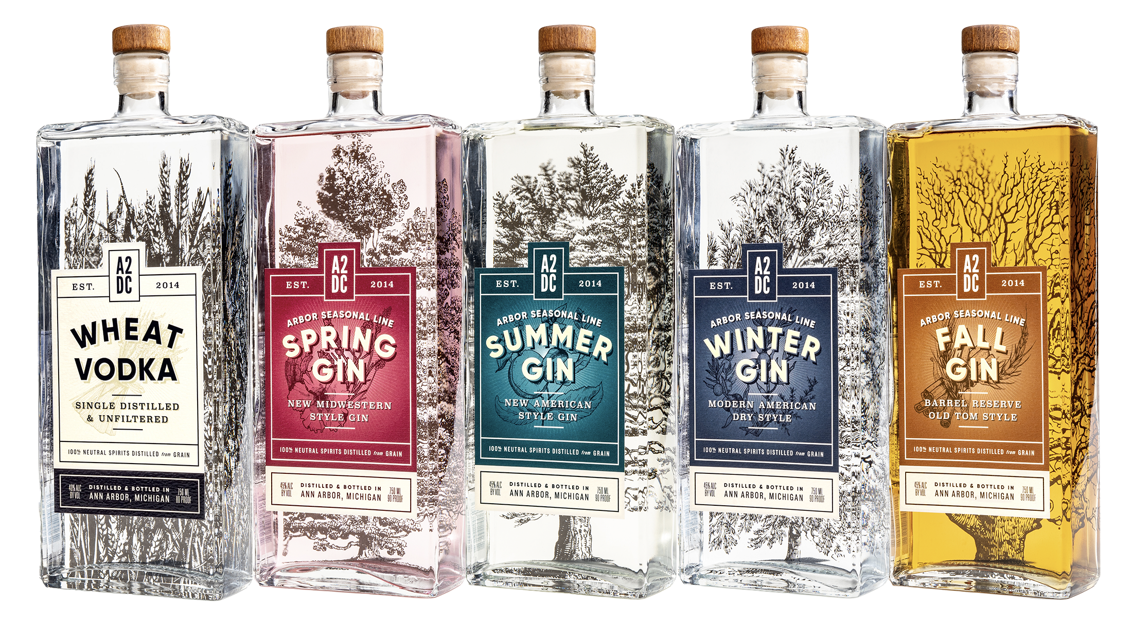
- Versatile, attention-grabbing designs: From minimalist graphics to dense regulatory information, these roll labels can accommodate infinite design visions.
- A cost-efficient alternative to direct print: For many short and medium runs, brands can maximize their budgets compared to using direct print techniques.
- Avoiding common transparent label problems: How to prevent common label problems like wrinkling, bubbling and flagging on clear labels.
Saving money on your labels should never compromise your brand. By consolidating SKUs and printing on cost-effective stock, Pelee Island Winery could focus their spend on the embellishments that mattered.
How to save 20% in label costs and still achieve a best-selling label
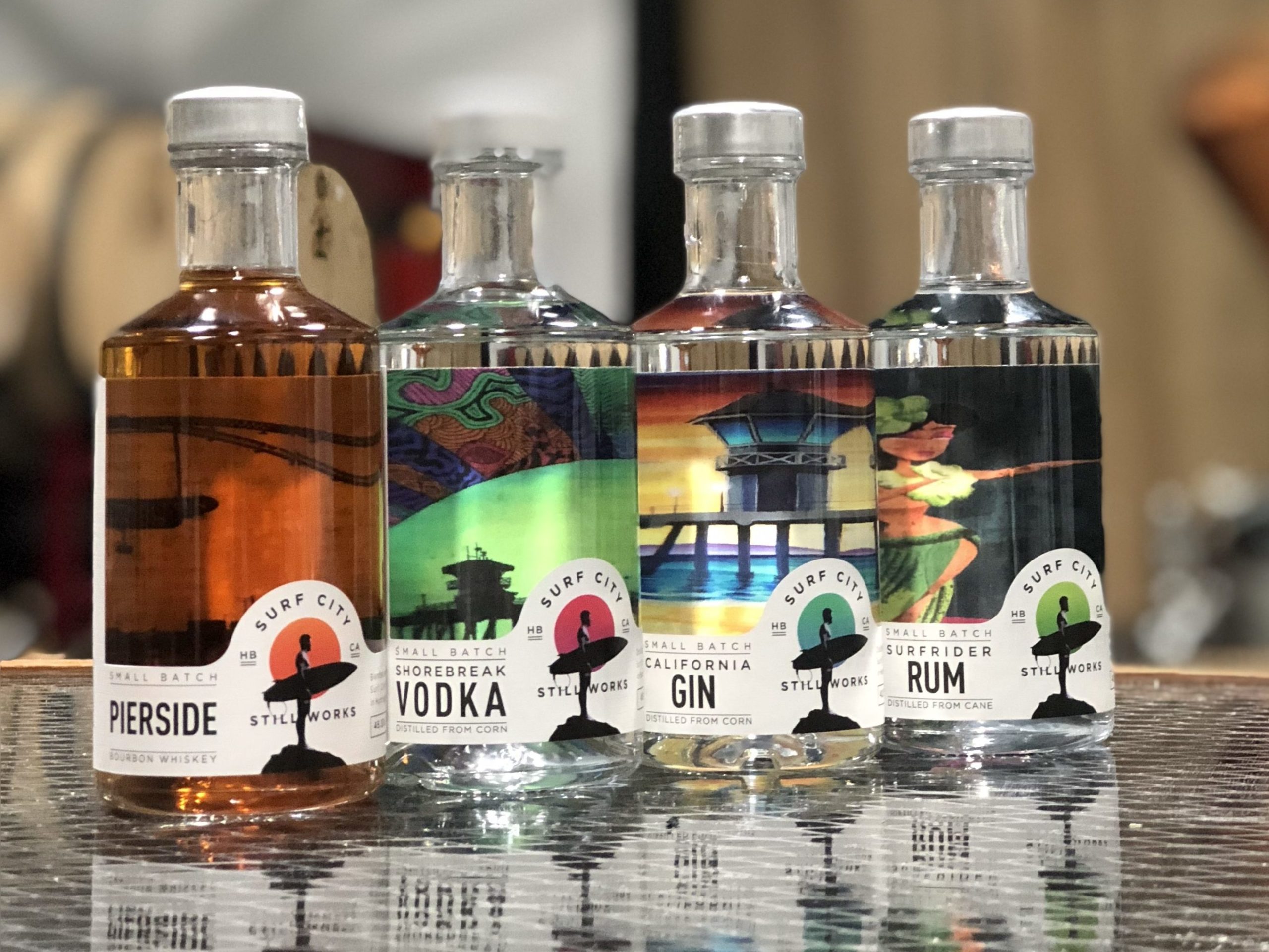
Clear film labels offer endless design concepts
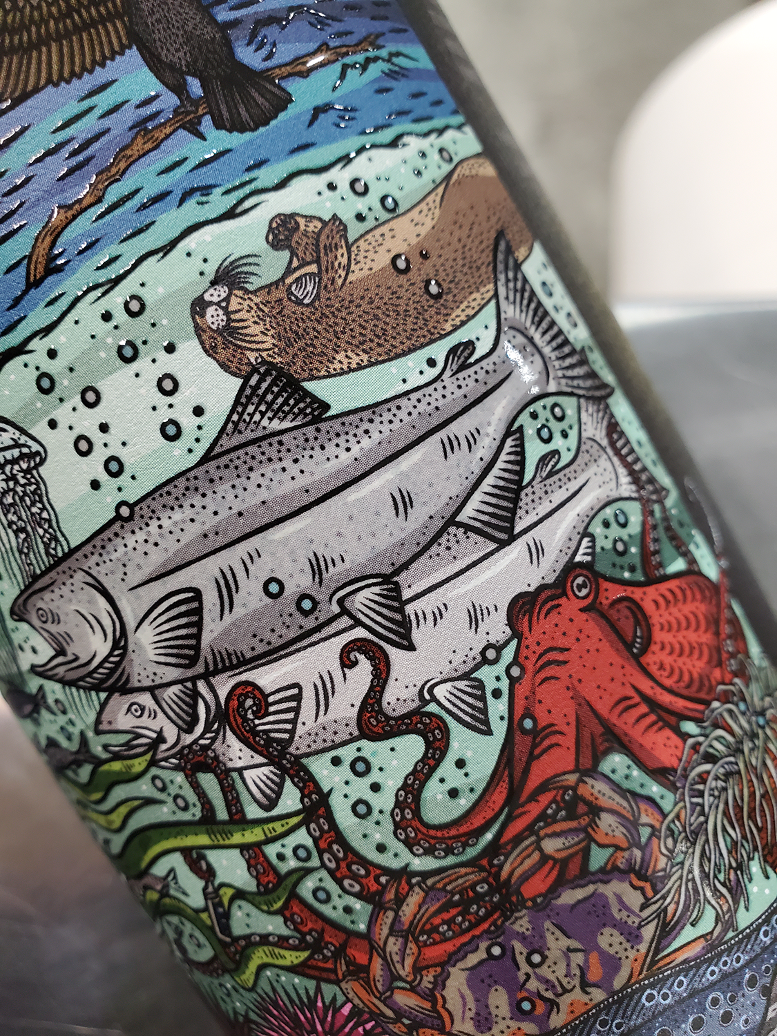
Products that appear to lack the seams of a label more effectively catch the eye because they look so clean and sleek. The no-label look lets you highlight the product itself, especially if it’s an appealing color designed to draw attention.
And for brands aiming for elevated visual effects, transparent labels are an excellent medium. But your design process needs guardrails.
Before committing to logos and artwork for a clear label, try answering questions like:
- Where will this be displayed and in what kind of light? — Transparent roll labels can cause your design to look different depending on whether it’s front- or backlit. With the wrong strategy, you risk fading into the background.
- How can contrast help my brand? — Set against dark backgrounds, light outlines can help graphics “pop.” By comparison, dark backgrounds with dark clear label inks can look muddy and amorphous. Some of the most successful clear labels we’ve seen incorporate both light and dark colors for eye-catching contrast.
Because these labels are see-through, your product or container’s color can impact the color of your label. For example, a blue product can make yellow spot colors turn green if produced incorrectly. During label printing, such issues are easily fixable by doing a complete container review prior to printing. Sometimes problems can be solved by running a few hits of white ink before the final yellow ink application for extra opacity.
While you can’t control every aspect of your product’s retail environment, these are the types of thoughtful design considerations that an expert label partner can offer.
Are you ready to explore your options? Get a quote today.
How can you make my label stand out?
By using elements like embossing, foiling, screen printing or custom die cuts, there are plenty of opportunities to elevate your brand. But with Resource Label Group, you get more than just a printer with embellishment capabilities — you get a partner.
Stunning clarity that lets your product shine
Clear labels can accommodate a variety of design visions, but that’s not their only winning quality.
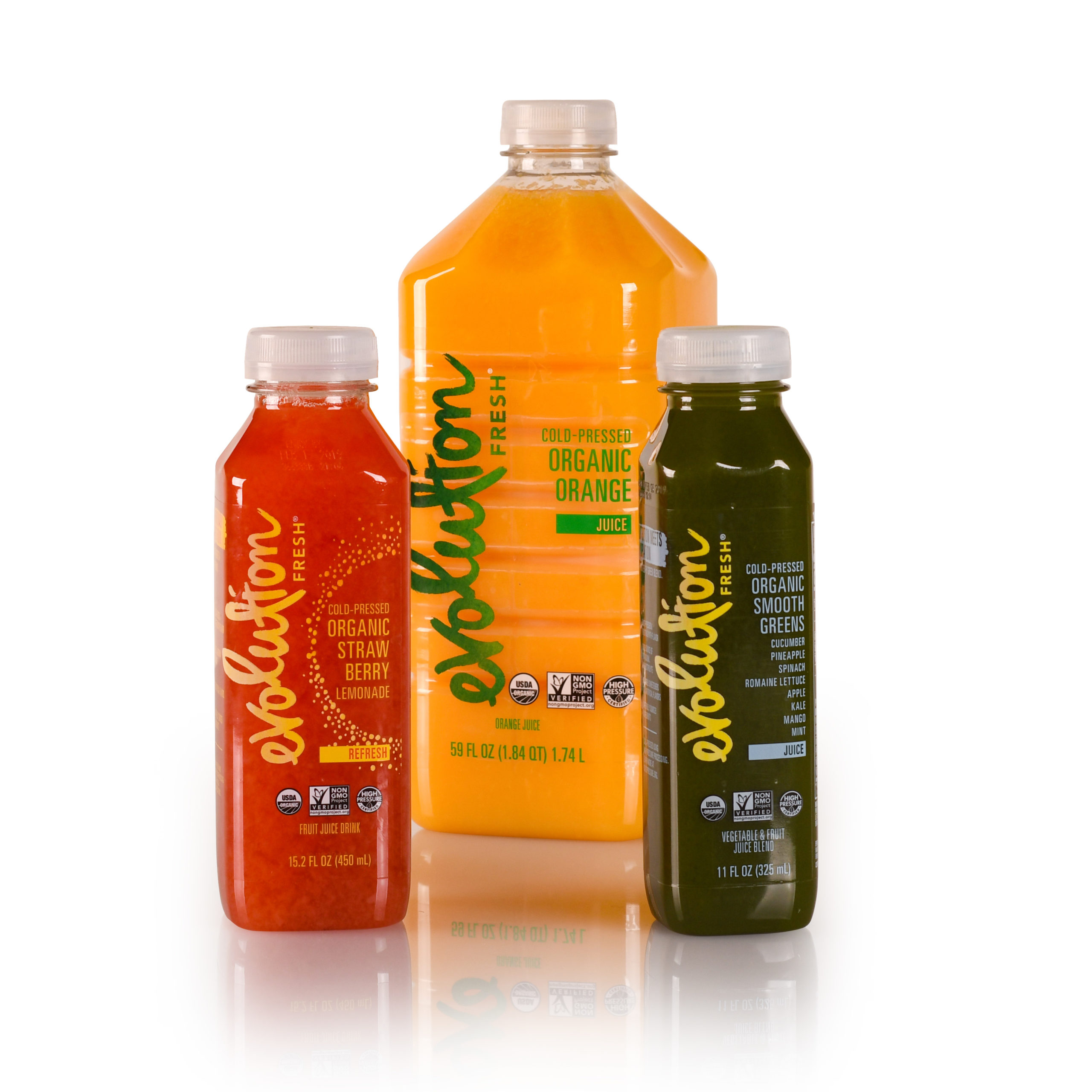
Sometimes, your product’s qualities speak for themselves. That’s why some brand owners choose transparent plastic or glass containers — because they want shoppers to understand their product at first glance.
Are you selling the world’s most pristine spring water? A mouthwash whose color communicates its flavor? If so, transparent containers and labels may be just as critical to your brand’s success as any other marketing or promotional efforts because you want shoppers to see what you’re selling.
Plus, you need to be able to deliver important regulatory and branding information without compromising that visibility. Along with branding, clear labels let you include essentials like ingredients and barcodes while minimizing interference with your product’s actual shelf presence.
Build depth with double-sided printing
It’s not uncommon to pair clear containers and clear products with clear labels. But in this combination, fully transparent front labels can interfere with the functionality of fully transparent back labels that hold critical product information.
Related reading: Top tips for effective front label design.
Overlapping text can be challenging for shoppers to decipher. To ease this, veil portions of the back label design with a semi-transparent layer of print to increase opacity. These double-sided labels create suitable backgrounds to increase the legibility of the front label.
Plus, this pairing adds depth to your overall design, creating product differentiation that lures shoppers in for a closer look.
Play peek-a-boo with imitation knockouts
If you’ve ever stopped to admire a label that features a “window” into the product, you’re appreciating the viewfinder effect. Engineering them is possible, but it can be costly and difficult to execute.
Knockout printing is a great alternative here. Instead of physically cutting a window, parts of the label are left blank while the print forms the frame around it. This clever graphic application onto a clear label lets you achieve the viewfinder effect without the challenges of a custom-cut label. This doesn’t just let shoppers see your product — it invites them to interact with it by “peering” through the clear window.
Another fun aspect of double-sided printing with a clear label is that the interior art will be magnified by the curvature of the container, and its appearance changes depending on its position. This adds a deeper layer of engagement with your product and brand as shoppers watch your art shapeshift in their own hands.
Mimic custom shapes without custom dies
Custom die cutting remains an ever-popular method for customizing label shapes, but when you use a clear label, you can achieve more adventurous shapes through ink application alone.
For example, if you envision a label shaped like an intricate tree, you’ll need to order a custom die. Clear labels allow you to simply print the tree while the label shape remains standard without compromising your vision of a standalone image on your product.
When done well, from pairing unique graphic shapes with eye-catching foil embellishments and tactile varnishes that mimic embossing (which otherwise cannot hold on film), your clear label can feel just like a luxurious, hand-cut label.
And what if my container isn’t clear?
That doesn’t necessarily strike out transparent labels. You can still have an opaque container and benefit from the no-label look, especially if you admire the “direct print” effect.
In fact, clear labels are common on beer cans, whose aluminum lends a metallic gleam beneath the punches of color on the label itself. With the right label provider, brands can either emphasize this effect or mute it with matte varnishes or opaque ink application strategies.
Related reading: Learn more about beer can labeling strategies.
Achieving direct print for a fraction of the price
Some brands don’t want their designs framed by outlines of a label, but the expense of printing directly onto a container can exceed preset budgets.
True direct printing requires tooling that can cost thousands of dollars. Plus, if there’s a printing mistake, your entire container is wasted. For brands committed to sustainability initiatives, this waste presents a serious problem. Furthermore, if your container has a unique shape, whether it’s a tight radius or an irregular surface, print coverage can be inconsistent and ultimately hurt your brand.
By contrast, label tooling can cost mere hundreds — and a label can always be removed and a new one reapplied. Clear labels present a viable alternative at a fraction of the cost, especially for multiple SKUs or short orders. And done properly, customers often can’t tell the difference.
For price-sensitive brands, that’s a good thing.
Preventing transparent label problems: haziness, adhesive interference and container shape irregularities
The no-label look is great in concept, but they must be engineered properly to achieve the best effect. Otherwise, you can end up stuck with a label that lacks the clarity you need or adheres unevenly to your container.
Clear labels need film facestocks, period. But with this material, adhesives, liners and even your container can interfere with your label’s final clarity. An inexperienced label provider may not know to steer you away from these problems, and that can cost you more money and more time than you’re willing to spend.
Related reading: Partner with an experienced label provider as early as possible.
A label partner will guide you through production issues you may not have considered, such as:
- Liner selection — Paper liners can leave a hazy residue on clear labels. If you have an opaque container or a transparent container filled with a white product like milk or lotion, that haziness may not be a problem. But if your goal is absolute clarity, you need liners made of polypropylene or polyethylene. (As a bonus, PET liners can steel you against supply chain instability, too.)
- Permanent adhesive selection — A clear, permanent emulsion acrylic adhesive is your best bet for preventing clear labels from appearing cloudy after application.
- Coating selection — Protecting your transparent label is important, but sloppy flood varnishing can cloud its clarity. A better option would be careful spot varnishing or laminate applications. Varnishes can also elevate the tactile experience of your label for shoppers. When a matte varnish is done well, your film label can feel like luxurious paper.
- Custom size — Bigger isn’t always bigger. If supply shortages force you to downsize your container, an adaptable label with tight borders and graphics is a big advantage. And in clear labels, small sizes with less negative space can draw attention away from container irregularities.
- Container shape and surface — Clear labels reveal everything. Paper labels can mask container surface irregularities like pitting or other imperfections, but clear labels may highlight them if designed and applied incorrectly. Does your container have an unusual shape, texture or seams? If so, label design that is divorced from container considerations can cause common label problems like bubbling, flagging, wrinkling and more.
If your prospective label provider asks for a container sample to run some tests, that’s a good sign. Whatever your vision, an expert label partner should be able to recommend the appropriate combination of liners and adhesives to help make your crystal-clear label goals a reality.
Related reading: Are you concerned about the supply chain? Watch this video to learn how Resource Label Group can reduce your risks.
Are transparent labels right for you?
Sometimes you just need a guide.
Our expert team is happy to answer your questions about how clear labels may suit your overall brand vision, or how to combine clear label techniques with other types of labels. The possibilities are endless, especially when you have the right partner.
Whether you have a concept to troubleshoot or questions about lead time, we’re here to help.