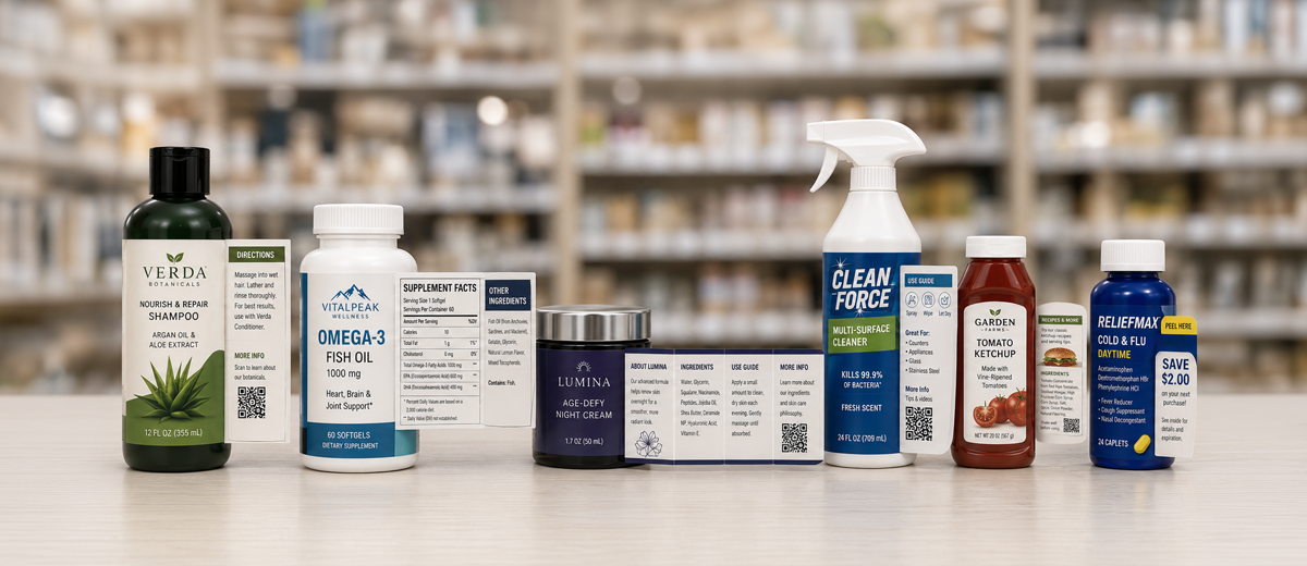
Top tips for an effective front label design

Your labels are the only advertisement for your products that 100 percent of your customers will see. When they make a purchase, it is your labeled product they hold in their hand. It’s the tangible, physical evidence of your brand. So even if they were exposed to your advertisements, your website and your social media, the burden of making the sale falls entirely on your packaging at the point of purchase.
A cohesive brand strategy is good business.
Brand penetration, the number of times you can get your brand in front of consumers, is vital to a sustainable sales effort. The more impressions you can make, the better. All your sales and marketing efforts are designed to sell your products, however, and that means putting your labeled products in consumers’ hands. A killer ad campaign and award-winning website are great, but if your labels are weak and overpowered by your competitors’ products on the retail shelf it’s time to invest more in your labels.
While there are no strict rules you can follow to guarantee a label design will be successful, there are fundamentals that go a long way towards elevating mediocre packaging to all-star status.

1. Get a sense of who you are sharing shelf space with
This requires some understanding of your competition, so the first thing you need to do is know your direct competitors.
To stand out on the crowded shelf and persuade shoppers to buy your product, it is critical to identify what differentiates your products from everyone else. And keep in mind you may have less than two seconds to communicate the key difference between your brand and competing brands. If you do not research your selling environment, any efforts you expend on brand messaging could end up communicating a message too similar to other brands or one that simply doesn’t communicate anything tangible.
- What makes your product special compared to the competition?
- What is the single most important benefit of your product, and will it inspire a purchase?
- What emotional connection does your brand make with consumers?
- Does your brand message instill a sense of trust?
- If you cannot answer these questions for yourself what hope do busy and distracted shoppers have in discerning your brand message?
2. Lock down your brand position
What is the story of your company and your product? Who are you? What truly makes your brand different, provably unique? Your business has a brand. If you are just getting started with your company, you will have a brand. Whether you actively work to create it or not, a brand will exist.
Even if you don’t have a great new logo or big-budget advertising campaign, your business has a brand. Your brand is this: the sum total of your company’s communication and actions, everything it says (or does not say), and everything your company does.
Successful brand owners actively control their brand message and understand the role of brand positioning in building brands:
- Establishes what the brand stands for and how it will compete
- Identifies the way we want consumers to think about the brand in the context of other similar products
- Creates an enduring, sustainable competitive advantage based on (perceived) superiority
- Strategies and tactics to market must be consistent with the positioning of the brand
The single most compelling and persuasive reason for a consumer to choose your products over a competitor’s is called the Point of Difference. This is something (preferably) unique to your product, or at least something you can leverage. It’s not enough to claim you’re the best unless you can prove it.
Knowing your brand’s point of difference will help you identify any areas where your product is competitively superior. It can be something broad and mainstream or more of a niche benefit, but it should address a need your consumers have.
When articulating the point of difference on your front label, use consumer terms and not industry lingo or marketing jargon. If you are offering a replacement for an established brand, it’s critical you communicate your individuality and your product’s benefits.
3. Less is often more when it comes to design and communication
The complete visual presentation of your front label design should be a simple one. After all, how much can a shopper be expected to absorb in mere seconds? Regardless of your label size, your visual and verbal communication should be direct and uncluttered in support of your core brand message.
Just like the Rule of Three in effective presentations, writing, and music, limit your dominant visual elements to a maximum of three. If you can create a strong brand message that is supported by less, all the better. Apple, Nike, Coke, and Mercedes are all brands easily identifiable by a strong, singular image, logo, or icon. Bombastic marketing copy and lists of product benefits clutter up valuable brand real estate on the front label. Consumers know they can find out more about a product by looking at the back label, booklet label, or hang tag. The purpose of the front label is to catch their attention quickly and memorably.
Similarly, colors and typefaces should be limited to three or less. Don’t forget to consider the container and label shape as potentially powerful elements of your front label design.
4. One brand element to rule them all
This is a difficult prospect for many brand owners, especially with new brands. The temptation is to fill your front label with numerous messages of apparently equal importance (see more on visual hierarchy in the next tip).
Ideally, your brand message can be distilled down to one core message – the very essence of your brand. Unless you are the only product in a category of one, or intend to simply package and sell the absolute cheapest product on the shelf, a simple, straightforward message or design element should be strong enough to differentiate your product from all the rest. Here are the four ways to position your brand, with examples of brands that use them:
Position and own the category benefit
- Volvo = “For life”
- Subway = “Eat fresh”
- Dairy Queen = “Hot eats, cool treats”
Position against the competition
- Apple = “Think different”, “Mac vs PC”
- Hallmark = “When you care enough to send the very best”
- Wild Turkey = “Not the latest thing, the greatest thing”
- Honda Motorcycles = “You meet the nicest people on a Honda”
Position how the company does business
- WalMart = “Always the lowest price”
- FedEx = “When it absolutely, positively has to be there overnight”
- State Farm = “Like a good neighbor, State Farm is there”
- Jameson Irish Whiskey = “Not a drop is sold till it’s seven years old”
Position the product and the consumer
- Budweiser = “For all you do, this Bud’s for you”
- Old Spice = “Smell like a man”
- Secret Deodorant: = “Strong enough for a man, but made for a woman”
- Sauza Tequila = “Life is harsh. Your tequila shouldn’t be”
5. Stay organized with visual hierarchy
The principles of visual hierarchy will help guide your design decisions, especially if you have followed the previous tips and settled on a solid brand position.
Focusing on the primary element, organize your label design elements in a way that tell the story of your brand in a few brief seconds. Secondary elements should be less prominent on the label. Your awareness of the competition from tip #1 will serve you well here. Find ways to stand out and get your message across quickly. Would a unique label shape, unusual (yet appropriate) color, or unique container give you instant visibility?
Ideally, the packaging will catch their attention, and each component of the label will guide them from one element to the next, seamlessly. Effective visual hierarchy will often continue around to the back label, drawing consumers deeper into your product and messaging. Clear, uncluttered, well-organized and eye-catching labels will be easier for consumers to find, and easier for them to remember should they desire to make a repeat purchase.
Color is the first thing shoppers notice, and the primary element that affects emotions. Shapes are secondary to color. Color and shape are supported by words, reinforcing the design and supporting the brand.

6. Consider how your products will integrate into consumers’ lives
Understanding who your potential customers are, and what type of lives they lead, is key. Define your ideal customers by their attitudes and behaviors – not simple demographics like age, sex, or geography. You will need to have some tangible insights about your customers and what their needs are. If you know who your target customers are, you should be able to answer “yes” to these questions:
- Does your product provide a clear picture of the user? In other words, does your packaging integrate with their lives, and how they see themselves?
- Are there any needs of this consumer group that are currently not being met?
- Is it obvious why the consumer should be interested in your brand? Your brand position should be crystal clear, simple, and out front.
Understanding the unique benefits or key differences of your products and understanding who your target customers are is just part of the challenge. Once you’ve identified them, you need to give them a Reason to Believe. Once again, simplicity is important. Articulate two to three reasons your product’s benefits are credible and believable. These can be economic reasons, functional reasons, or reasons that make an emotional appeal to the consumer.
7. Look like you belong, and stand out at the same time
For every product category in a retail sales environment, there are established customs for packaging. Not all of them need to be followed, in fact ignoring them can be one of the easiest ways for your products to stand out.
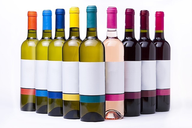
Certain conventions are ironclad, however. When it comes to most food packaging, consumers prefer to see the products within or at least high-resolution photos of the food. In the wine category, muted, minimalistic designs with few colors convey a sense of luxury, while bright, busy, and super colorful labels can appear cheap. Vitamins and nutritional supplements can range from subdued earthy tones to vivid, metallic foil labels, depending on the target consumer.
Identify the conventions in your category and look for ways to break out and stand apart from the competition – without appearing as though your products are completely unrelated to the category. Wine should look like wine, not dish detergent placed on the wrong shelf.
With a strong brand message and a relevant design that stands out, you also increase the possibility of your labels making an impression that lasts. Even if a customer doesn’t recall a product name, they should be able to remember the appearance of the label when browsing – even on crowded shelves.
8. Enduring brands are flexible and adapt well to future products
When you create your brand message and packaging design, it is a good idea to consider how well it will work with future products or category extensions. If the size and shape of your labels were to change, could your design be adapted and still maintain the same overall appearance? Are there elements of the brand and design that can be easily applied to other products in the future? Will the design work whether it’s applied to a label, a business card, website or advertisement?
A strong, recognizable logo or distinct icon can be effective. A bold color scheme can also become part of your overall brand – think Coca-Cola red or Kawasaki green, for example.
Ideally, you want to avoid having to completely start over with branding and design, especially if you have built up some recognition over time.